Our icons are symbols that represent functionality or content. We have many that relate specifically to our products and services, along with basic universal symbols. Icon downloads are available in the Design Tokens section.
Icon artwork
We use line icons with transparent fills. When designing new icons, use an initial stroke weight of 3px, which will eventually converted to shapes instead of strokes. This thickness allows us to scale up or down without a loss of legibility at small sizes or an overpowering field of color at large sizes. Typically, the icons will be displayed at 25 to 100px. Using them at smaller or larger sizes is not recommended, but special icons can be designed with thicker strokes for consistently smaller uses, such as alongside navigation menu items.
Our icon set must be completely interchangeable for consistency. For this reason, we design our vector icon files on a 100px x 100px canvas, with the artwork limited to 86px on the longest side. This provides adequate white space to compensate for different shapes, allowing the icon base to be visually centered.
SVG code
It is important to construct the files properly, as we use SVG code to display and manipulate them on the website. Apps tend to write the SVG code differently depending on their settings, and while the differences may not be visible in the rendered artwork, there are important fomatting rules for our icons used in Drupal components.
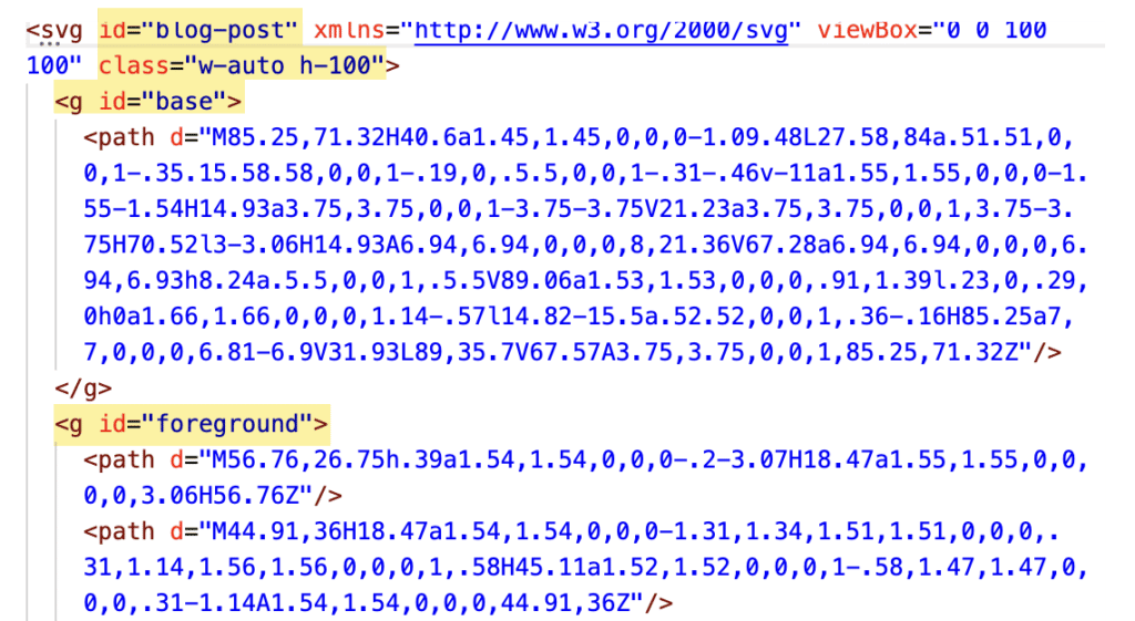
The artwork layers should be grouped and labeled as “base”, “foreground”, and “accent”. In this way, we can target those groups in the code to change color or even animate the layers individually. (If only one group is present, it will be called “base”.)
No fills should be specified—color can be controlled via component settings.
The ID name for the SVG should match the filename.
Do not specify height and width, as the icons are responsive and are controlled by their parent containers.
We do add classes of “w-100″ and “h-auto” to maintain aspect ratio at all sizes and alignment settings.
Do
Label SVG ID and layer groups correctly and add “w-100” and “h-auto” classes.
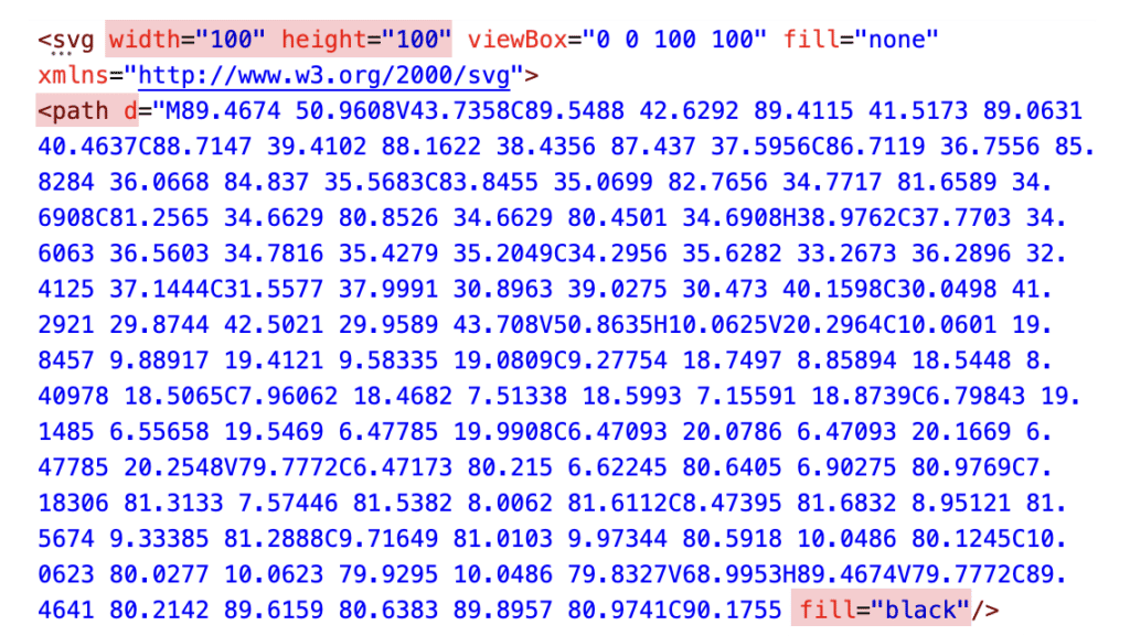
Don't
Do not use ungrouped paths (layers) or add fills or specify width and height.