Imagery
Image styles for Allied Telesis properties are more nuanced than simply depicting relevant subject matter. Considerations like color psychology, contrast, balance, and emotion help us convey helpfulness, professionalism, and trustworthiness.
Use jewel color tones
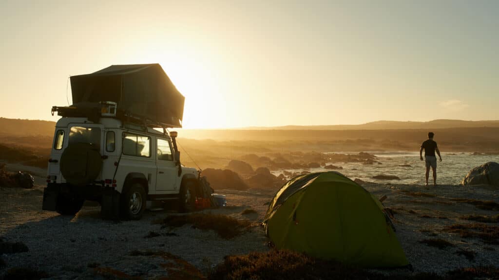
Images should use jewel tones: rich, highly saturated, vibrant hues. Jewel tones are so-named because they’re inspired by the colors of gemstones, so think of sapphire blue.
Avoid muddy, dull, earthy or pastel color tones.
Do
Use highly saturated colors that are relatively bright.

Don't
Lifestyle photography
Technology-related images are intriguing ways to illustrate a story such as a news article or blog post. We use abstract images that include light and motion to convey speed, strength and reliability in our products and networking operations. Color should be vibrant but low-contrast to keep the focus on the text when used as background images.
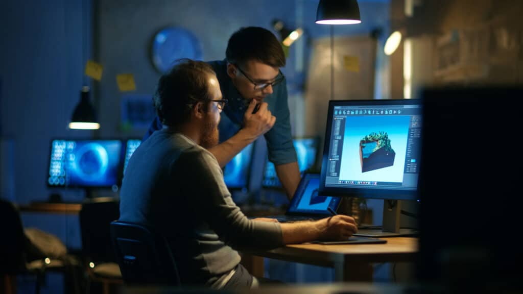
In photos with people, our attentiveness and professionalism can be indicated by a sense that our subjects have been photographed candidly, as if in the midst of doing a job for a customer or enjoying our products and services. We avoid images that appear “posed”, as this compromises the trust of our viewers. Direct eye contact in photography should be limited to intimate efforts like social media and targeted campaigns, and should still be relevant to our products.
Do

Do
Don't

Don't

Product photography
Our engineers and designers create highly detailed 3D CAD renders of our products. Using rendering and animation software, we can control angle and pitch, color, light and shadow to highlight key product features.
Angle and pitch
Angle: 13° on average; 12° for long products, 15° for short products
Pitch down/angle: 10° on average, 8° for deep products, 11° for short products
Variations: NICs, XEM modules, optical and wireless products can be angled in the reverse direction.
Color matching and lighting
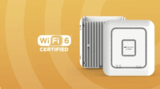
Lighting, shadows and color should also be kept consistent on all product images and matched to the example images shown here.
Close attention should be paid to consistent color, the CMYK value of the gray on the product should be corrected to C21, M14, Y15, K0.
Shadows
The shadow should appear in the same style on all of the standard product images. It’s important to consider the angle of the light source and extend the shadows into the surrounding space, rather than simply adding a drop shadow, for a convincing three-dimensional effect.
We no longer use reflections, as they may appear outdated.
Background Colors
Product photos can be shown individually, or as a group, but should always have a white or transparent background. Exceptions can be made for ad campaigns, but great care should be taken to ensure the surrounding color enhances the product, rather than detracting from it. Always get approval from the Marcoms team to ensure the image is on-brand and is consistent across campaign assets.
Do

Do
Don't

Marketing campaigns
Digital ads and landing pages
When planning an ad campaign that will span several channels, such as print ads, digital ads, emails, and social media, we consider the journey our audience takes from the first interaction to making contact with Allied Telesis.
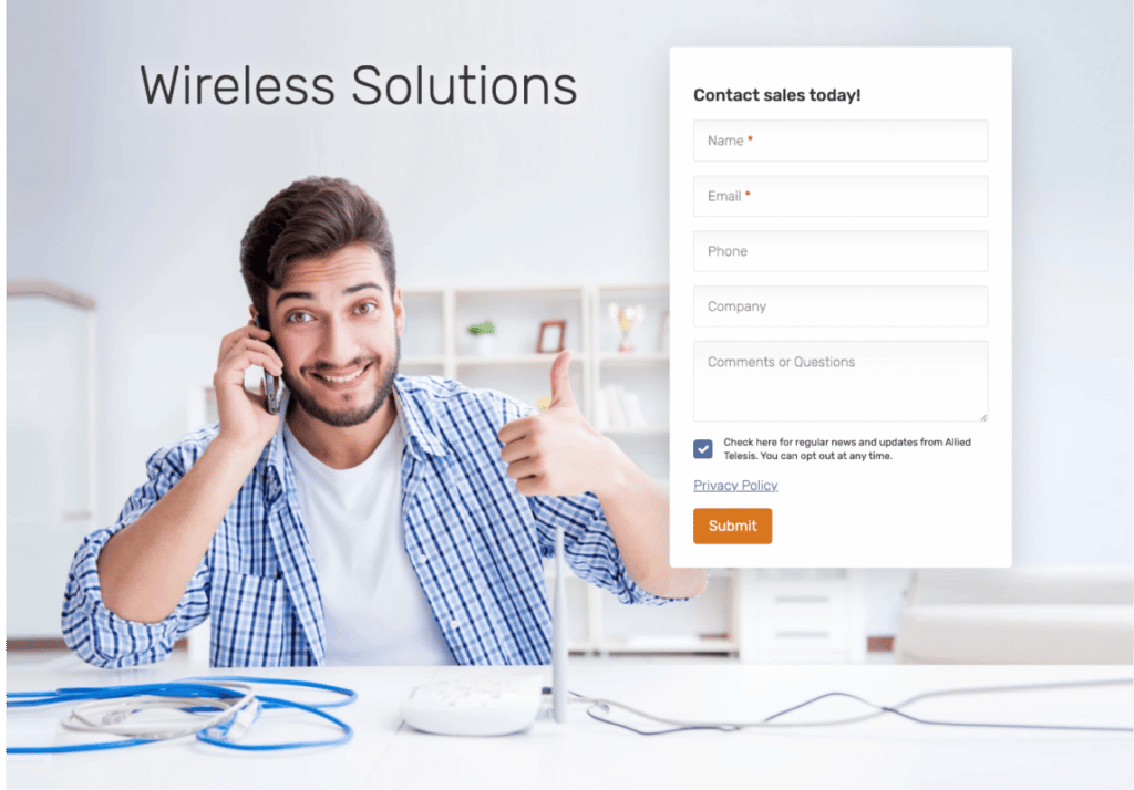
All elements should share a visual theme to assure the viewer they’re continuing along the path to a single goal. Using a consistent color pallet and text styles is always best practice, but there are many ways to create a visual theme—for example, images can be related by using only either indoor or outdoor lifestyle photography, the same model(s), either dark or light dark abstract images, or graphic elements that share the same style.


Social Media
Consider the difference between the features and benefits of a product or service. Features are specific to design and operation, while benefits illustrate the lifestyle changes that occur when the product or service is put into use.
Feature example:
- “AMF Security controls network traffic by using the OpenFlow protocol over the TCP connections established with the switches.”
Benefit example:
- “AMF Security lets you build a network that defends itself for instant threat responses without manual intervention.”
Interacting on social media is a chance to connect with customers on a personal level, so we appeal to our customers’ commitment to improvement by focusing on the benefits we offer—personal service from a friendly and professional team of experts that will ultimately result in an enhanced network environment and better quality of life.
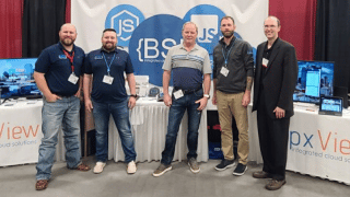
We accomplish this visually by using photos of relatable people enjoying the benefits of our services, whether learning about them, deploying and managing them in a business setting, or enjoying them as the end user. This can include photos of our staff at interactive events, scenes of business professionals conducting successful remote meetings, and other positive personal experiences. In this capacity, subjects looking into the camera are acceptable as this helps us male a personal connection.
Do

Do
Graphic elements
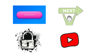
All graphic elements must have a specific purpose, such as identifying a category or instigating a call to action. Our style is friendly yet professional, rather than quirky or whimsical. We use line art icons and avoid grungy, sketchy, over-rounded or “bubble-like” elements, as well as outdated trends such as deep bevels, reflections, or high-contrast gradients.
Only colors from the approved pallet should be used.
Do

Don't
Because services are more challenging to represent visually than products, we hav incorporated isometric illustrations on Services and Support section the website. These can be static or animated, but should all follow the same illustration style regarding personality and complexity. The Allied Telesis color palette should be used as much as is practical, especially in large fields of color.