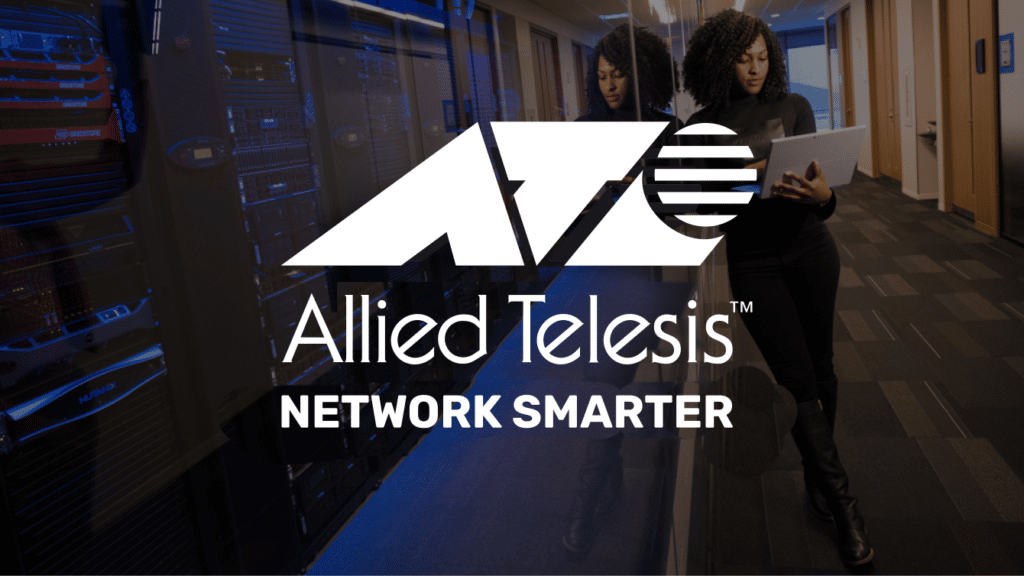
Our graphic tagline is designed to help establish our identity and positioning as a network solutions provider and valued partner in a variety of vertical markets, as opposed to being simply a “box supplier”.
Proper tagline usage
The Allied Telesis tagline should appear only in black, 45% black, or white. The white application should be used in instances where the tagline is reproduced over a background color or photograph. The tagline must never appear in any other colors. Individual elements should never be altered, misplaced or discolored. It should appear on every piece of marketing communication, but used discreetly. The tagline should not be the focal point of the piece.
Graphic tagline
Use only supplied, approved artwork. May be reproduced in one or two colors depending on your print specs. Use correct artwork for your print application.
Text Tagline
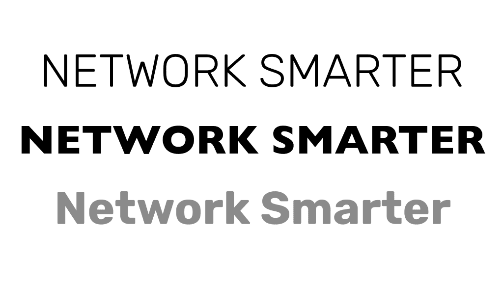
The tagline can be created using Rubik Bold. Tagline should only appear with the company name. In no circumstances should it be used without the company name, either as a logo or as text.
Tagline should always appear in 45% black
Tagline should always appear in upper-case text
Tagline should appear in English in all regions
Tagline should align with the “Allied Telesis” logotype (not including the trademark symbol), and have a vertical distance below the logotype equal to the height of the “O” in “NETWORK SMARTER”.
Legal considerations
The tagline is not protected by registered trademark.
For legal reasons, any collateral that is produced for global use should not include the trademark symbol. The tagline is subject to change as our business focus evolves. Use of the tagline should be limited to promotional or marketing focused collateral.
We should not use the period for “NETWORK SMARTER”. We should not use “NETWORK SMARTER” in a sentence, but only as a tagline. We can write “network smarter with Allied Telesis” in text.
Do
Always set the tagline in Rubik Bold, uppercase, black-500 (#8b8b8b) or 45% black
Do
Use tagline as part of a digital ad or video end screen in either 45% black or 100% white.
Don't
Do not use any other font family, size, or weight to create the tagline. Use all caps only.
Website Identifier
To provide access to our contact information and increase awareness of our global corporate website, as well as to enhance brand recognition, we include a link to our website at the bottom of all collateral, alongside our tagline. The website URL should always be rendered in Rubik Semibold and in our corporate red. Include a pipe symbol in the same color as the tagline, surrounded by 1 em of space, to separate the two elements. Do not use “www” with our website URL.
Sizing
When using either the approved artwork or live text, the size of both the tagline and the website identifier should be slightly smaller than the Allied Telesis logo. To size correctly, ensure that the total height of the tagline is the same as the height of the i (not including the dot) in “Allied Telesis.” When used side-by-side, logo and tagline should share a common baseline.
Tagline as part of a page footer, including the website identifier and Allied Telesis logo